BitMarket
Brand Vision: The branding for Bitmarket was conceptualized with the aim to inject vibrancy and a sense of modernity into the Bitcoin ecosystem. The vision was to create a brand identity that not only stands out in the crowded crypto market but also resonates with a sense of excitement and innovation. Bitmarket, as a Bitcoin Layer 1 prediction market, needed a brand that communicates trust, technological sophistication, and the thrill of real-time betting directly on the blockchain.
Brand Elements:
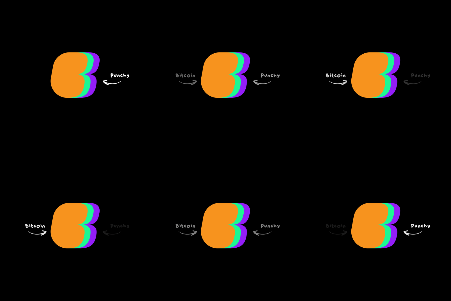
Logo: The logo design incorporates dynamic elements that symbolise movement and growth, reflecting the ever-changing nature of cryptocurrency markets. It uses a sleek, bold font combined with a minimal B shape.
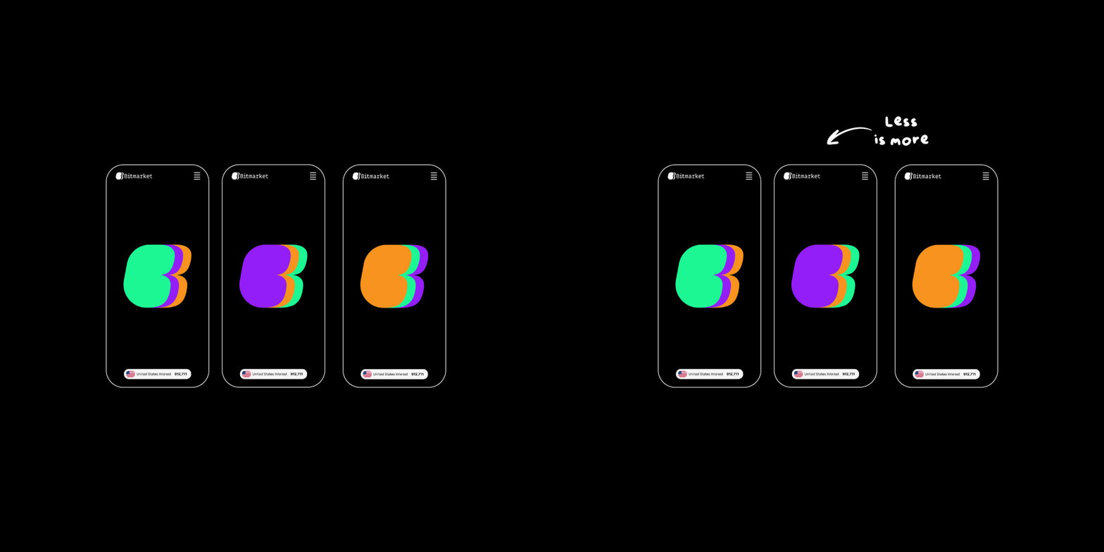
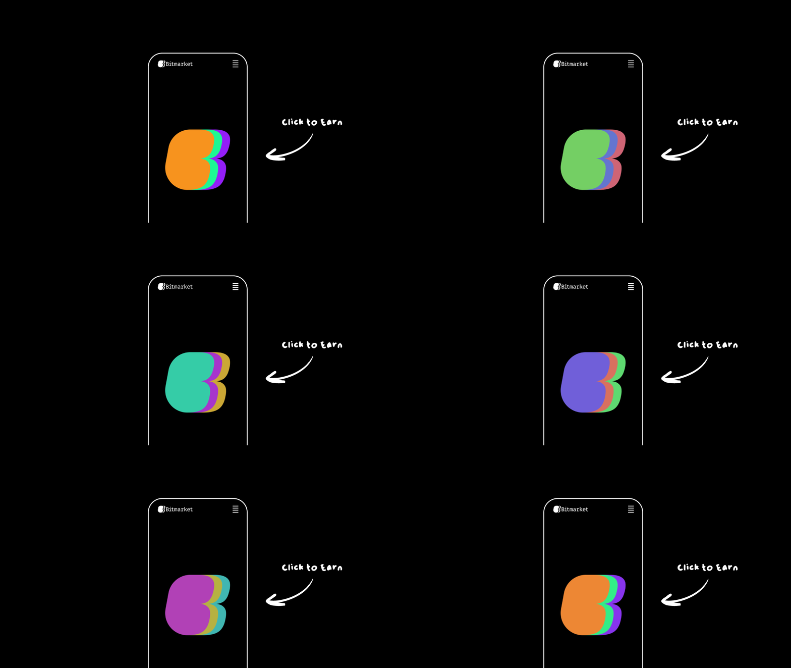
Colour Palette: We chose a palette that includes the BTC orange, and 2 punchy complimentary colours, deviating from the dated palettes often seen in the bitcoin ecosystem. This choice aims to capture attention and convey innovation.
Typography: The typography selected for Bitmarket combines modern sans-serif fonts for digital readability with a touch of custom lettering for uniqueness, ensuring the brand feels contemporary yet grounded in its tech roots.
UI Design Strategy:
Landing Page:
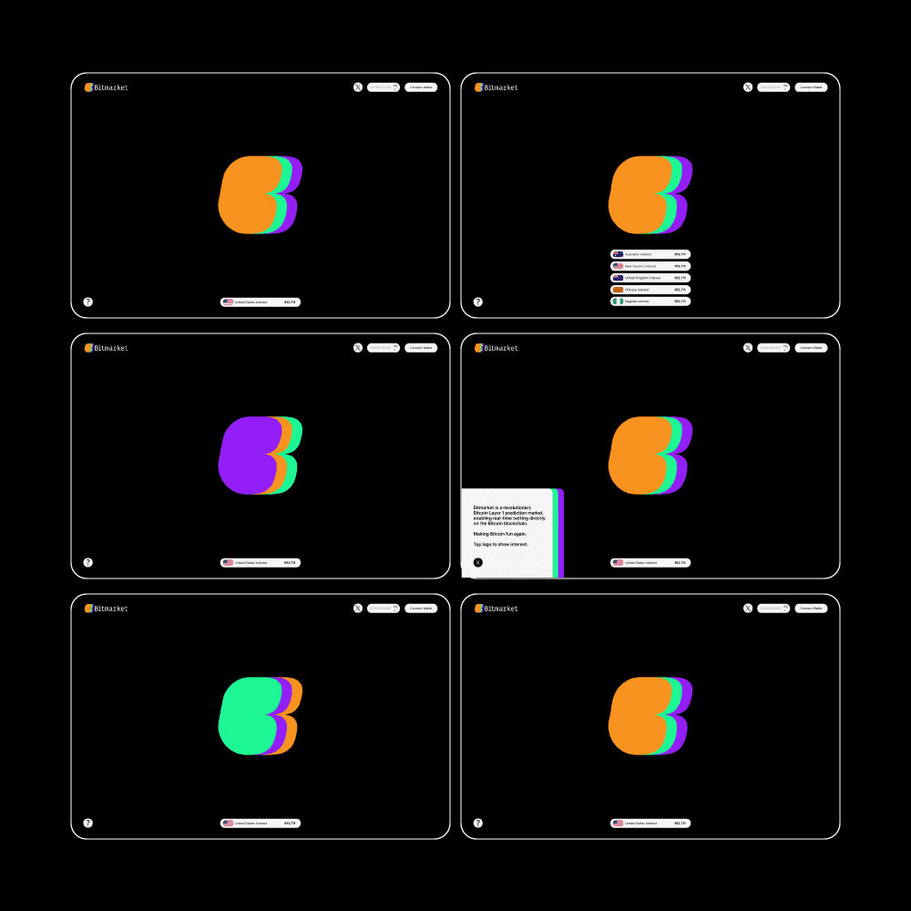
Purpose: The landing page was designed to generate excitement and awareness. It serves as the first touchpoint for potential users, aiming to engage the visitor through interactive and visually appealing elements, hinting towards an airdrop in an easy to funnel way.
Design Features:
Interactive Elements: Clickable logo, airdrop counter and geographic location attached.
Visual Hierarchy: Clean, punch and bold.
User Engagement:
Airdrop Campaign: An integral part of the UI design is the integration of airdrop mechanics. This not only incentivizes early adopters but also collects valuable demographic data for further marketing tailoring.
Feedback Loops: The page includes feedback loops based on a number for clicks, the user will know where they are sitting at all times, making it competitive between users.
Consistency and Cohesion: Every UI element reflects the brand's identity, from button styles to iconography, ensuring a cohesive experience that aligns with Bitmarket's ethos of simplicity, transparency, and excitement. The design aims to make complex blockchain technology accessible and appealing, fostering a community around this innovative use of Bitcoin's network.


