Mong Coin
Brand Vision: The rebranding of Mong Coin was aimed at revitalising its image, making it more relatable and competitive in the new meme coin market. The strategy was to place a huge emphasis on the 'Mong Purple' while crafting a brand personality that's both edgy and anti-social, traits that resonate well with a certain segment of the memecoin market.
Key Components of the Rebrand:
Colour Revival - Mong Purple:
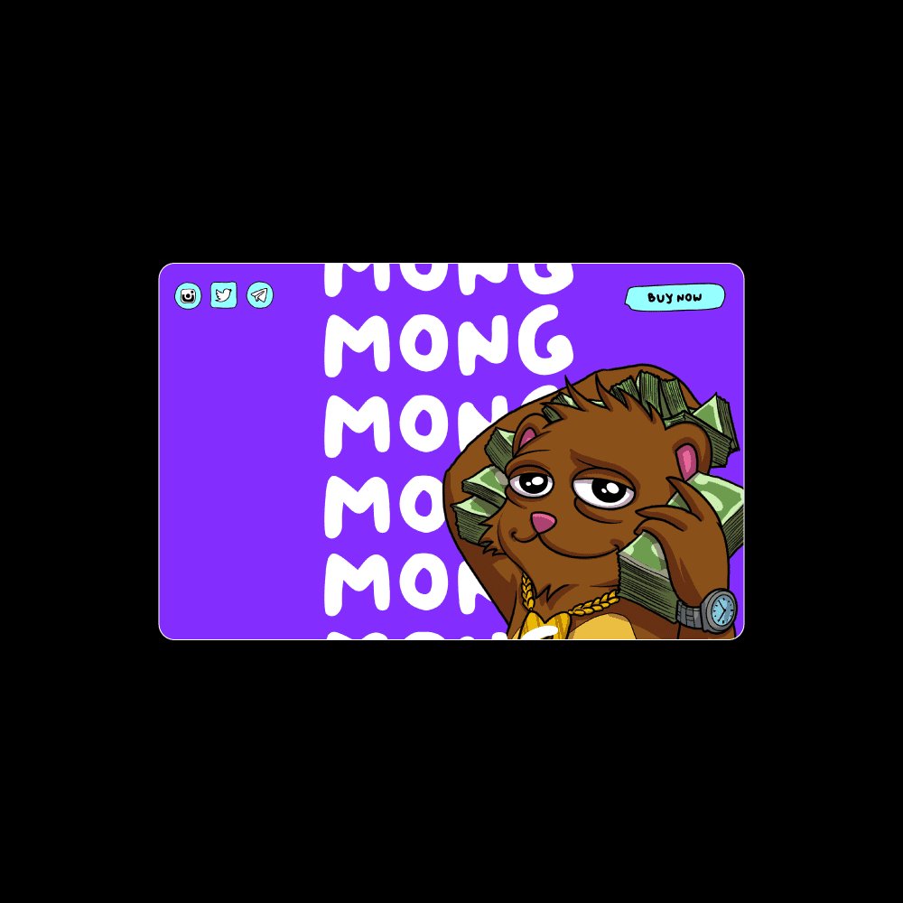
The iconic 'Mong Purple' was not just brought back but was made the focal point of the brand's visual identity. This colour was used across all touchpoints, from the website to social media, creating a strong, cohesive brand presence.
Character Redesign:
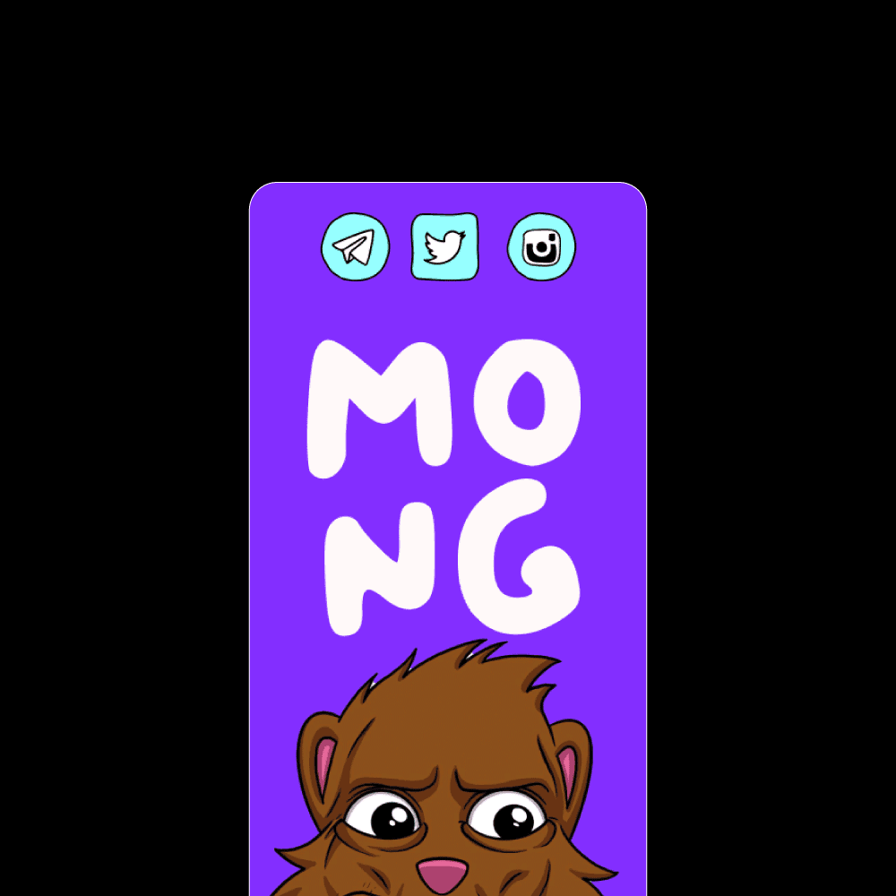
Artist Collaboration: An artist was specifically onboarded to redesign the Mong character. The art direction focused on amplifying the character's anti-social and edgy traits, giving it a more pronounced, perhaps even anarchic look that aligns with the brand's new, bold direction.
Mong's Persona: The design aimed to portray Mong not just as a mascot but as the rebellious leader of its own narrative, enhancing the coin's appeal to those who value individuality and non-conformity.
UI/UX Overhaul:
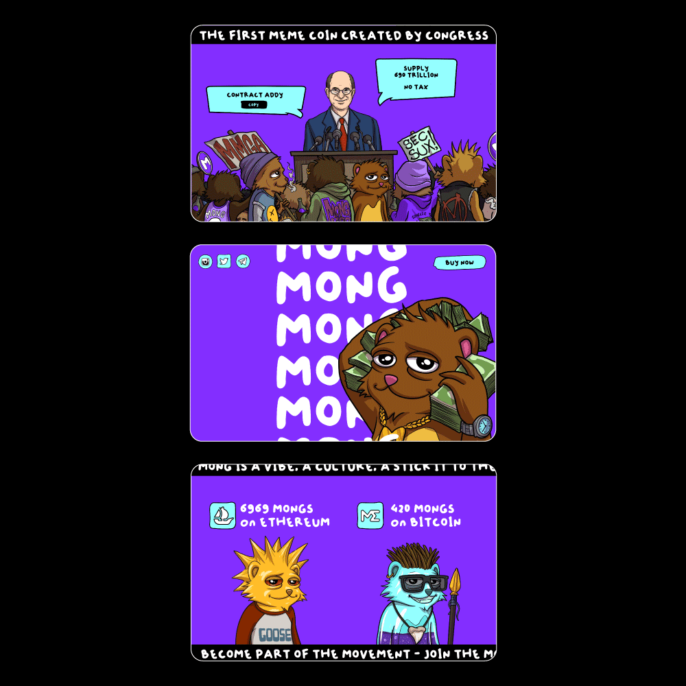
Hand-Drawn Aesthetics: The user interface elements, including icons, buttons, and typography, were all designed to appear hand-drawn. This approach was to give the impression that Mong itself took charge of the rebranding, adding a personal, almost DIY feel that's rare in the digital asset space.
User Experience: The user experience was refined to be more intuitive and engaging, removing un-necessary friction points that would confuse new people entering the mong ecosystem.
Social Media Overhaul:
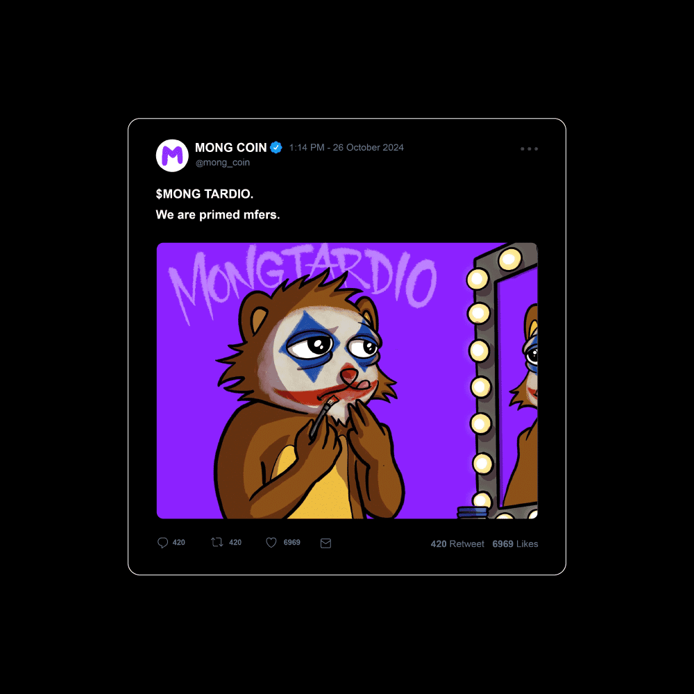
Visual Consistency: The Mong Coin X was updated to match the new design language, using hand-drawn graphics and the dominant purple theme.
Engagement Strategy: The content strategy was adjusted to reflect Mong's new identity, with posts that might include memes, satirical takes on crypto news, or direct, trolling interactions with followers, playing into the anti-social yet engaging persona.
Complete Identity Update:
Brand Messaging: The tone of all communications was shifted to be more direct, brutal, and in line with the character's anti-establishment tendencies, ensuring that the brand's voice was as disruptive and memorable as its visual identity.
Outcome: The rebrand of Mong Coin was executed to make it not only visually distinct but also to give it a personality that stands out in the meme coin market. By using hand-drawn elements and focusing on an edgy, anti-social character, the redesign has crafted an identity that feels authentic, rebellious, and highly engaging, appealing to an audience that values originality and defiance in the crypto space.


